Thanks to the brilliance of modern branding and logo design, most companies today seem like creations of the modern world, despite almost all of them being rooted in the 20th century. (Some, like Coca-Cola, are even older). In fact, very few brands launched in the current century have yet become truly global concerns.
That will change over time, of course, as young upstarts grow and take the place of older rivals. But right now, companies founded during years that start with a ‘19’ continue to rule the roost.
There are exceptions, however, and not surprisingly they all come from the fast-moving tech world. In this post we pay tribute to some of the movers and shakers who’ve stirred things up in the 2000s and 2010s, and the branding that’s helped them establish that dominance.
01. Firefox
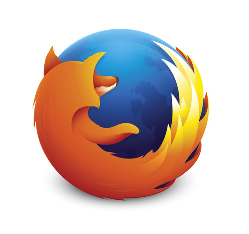
Once upon a time, a long time ago, there were two rival browsers dominating the web: Microsoft’s Internet Explorer and Netscape. The former eventually eclipsed the latter, but out of Netscape’s ashes came a new browser, based on the same code, and created as part of an open source project.
The logo for what became Firefox 0.8, launched in 2004, was a concept from Daniel Burka, that was sketched by Stephen Desroches and then rendered by Jon Hicks using Fireworks MX; you can read more about how it was created here. The strikingly literal logo has been tweaked and updated many times since, and yet its basic essence remains: a true modern classic.
02. Chrome
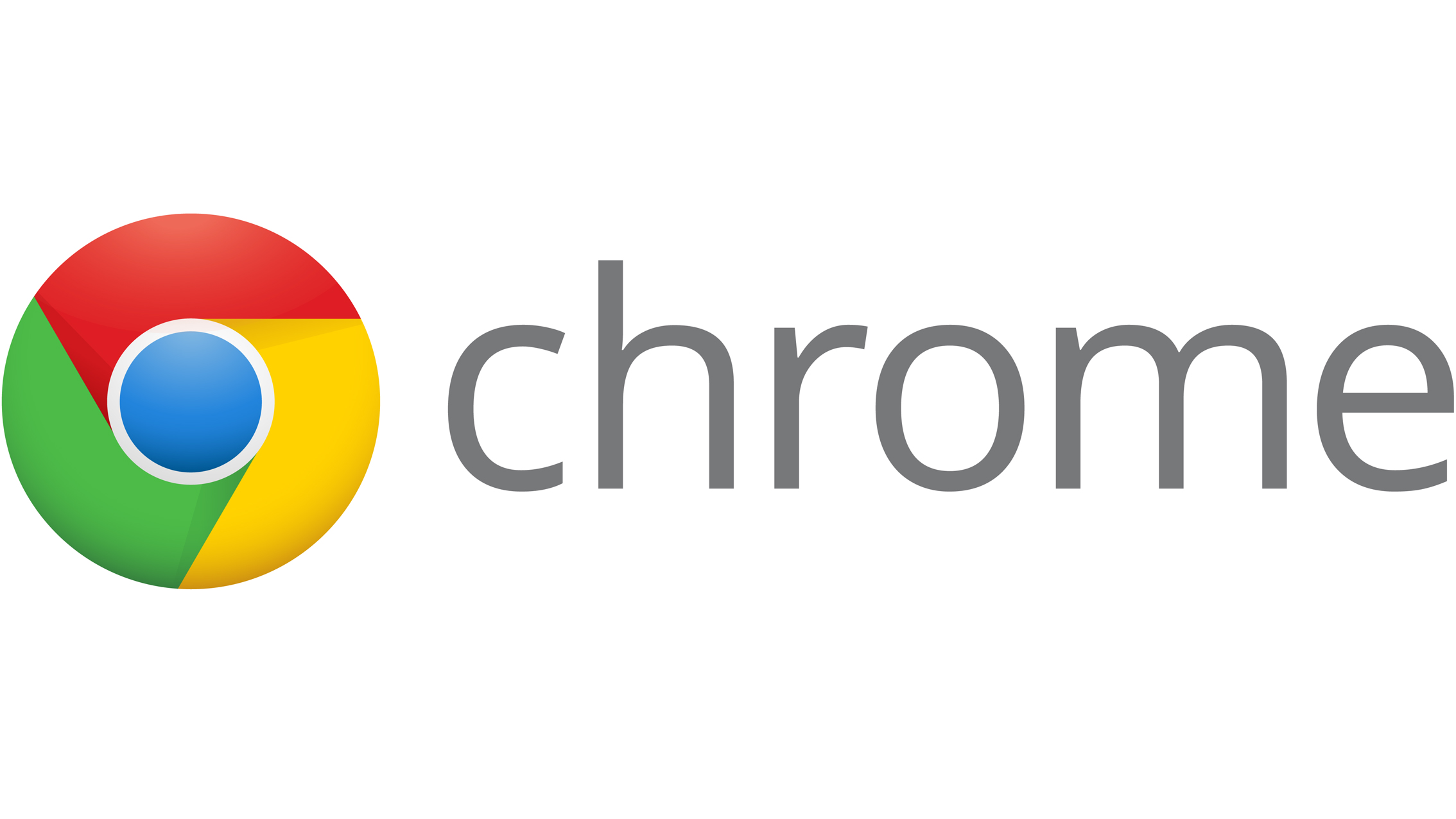
If the early years of the century saw tech observers fretting over the dominance of Internet Explorer, the ensuing years put their minds firmly at rest. Following the success of Firefox, in 2008 Google launched its own browser too, Chrome, and it wasn’t a bad move at all: by November this year StatCounter estimated it had a 51 per cent share across all web platforms.
Created by illustrator Michael Lopez and front-end tech lead Ben Goodger, amongst others, the Chrome logo tied in nicely with the company’s overall look, extracting the red, green, yellow and blue colours from the letters of the main Google logo. The original design had a glossy, 3D skeuomorphic look, but was given a simplified, flat makeover in 2011 that has pretty much stuck to this day.
03. Facebook
It’s hard to remember a time when social media meant Friendster and MySpace. But it was only in 2004 that Mark Zuckerberg launched Facebook onto the students of Harvard University, eventually infecting the entire globe with its schema of pokes, shares, likes and status updates.
Designed by Cuban Council in 2006 in collaboration with Joe Kral and Peter Markatos. the Facebook logo has become one of the most recognised symbols in the world today. Largely unchanged since then, it features a slightly modified form of the Klavika Bold typeface.
This 2015 version of the wordmark was designed in collaboration by Facebook’s in-house design team and Eric Olson of Process Type Foundry.
04. Twitter
While Facebook has become one of the world’s most profitable companies, its real-time rival Twitter is still trying to work out how to monetise. But the microblogging service, created in 2006 by Jack Dorsey, Noah Glass, Biz Stone and Evan Williams, has nonetheless made a huge impact on the world, from the Arab Spring uprisings to the success of Donald Trump.
As such, the Twitter logo has remained constant, and the brand is determined that it remain so. “The Twitter logo is a powerful symbol for what’s happening in the world now, and the power of the voices and unique conversations that happen on the platform everyday,” they point out, in urging people to stick to its strict brand guidelines.
The original wordmark for Twitter was created by graphic designer Linda Gavin, who was given just one day to develop a new logo in time for its official launch on July 15 2006. The third Twitter redesign, created by in-house designer Douglas Bowman and released on June 5 2012, saw the introduction of the famous bird icon. You can learn more about Twitter’s logo evolution here.
05. Netflix
Netflix has the dubious accolade of becoming a euphemism for sex, in the form of ‘Netflix n’ chill’. Perhaps more importantly, the brand which in 2007 transformed from a DVD rental company to a streaming media service has changed the way we watch TV forever. Watercooler talk has morphed from ‘Did you see the latest episode last night?’ to ‘No spoilers, I’m binge-watching season 5 this weekend.’
In fact, it’s become such an institution, so quickly, that this year there were howls of anguish over the dumping of the ‘classic’ Netflix logo in a favour of a minimal red ‘N’ icon. The good news is that those fears were unfounded: the latter is a secondary icon for use at very small sizes, and doesn’t replace the tried and tested wordmark.
While that logo has been tweaked and flattened over the years, it retains its essential essence, with a pleasing curve to its seven letters that conveys idea of a comfortable, widescreen experience. You can see the latest version above, designed by Gretel.
06. TripAdvisor

How did we manage to book hotels before TripAdvisor? The online travel forum, founded in 2000, has made good customer service paramount for any tourist-facing business in 2016, and a jolly good thing too.
It’s logo has become an icon, proudly displayed by the best-awarded businesses, with its owl emblem representing the wisdom of planning your trip ahead, and the binoculars symbolising the search for a good deal. Did you ever notice that one of the bird’s eyes is red and the other green? This is a traffic light effect, symbolising the places tourists choose to visit (green) and not to visit (red).
07. Airbnb
While TripAdvisor has changed the way hotels operate, Airbnb has changed what we think of as a hotel. Enabling normal people to rent out rooms to visitors has opened up a whole new type of tourism, which the company is keen to trumpet with its slogan: ‘Don’t Go There. Live there’.
Launched in 2008, Airbnb had fairly mundane branding until it released its current logo design in 2014 to howls of controversy and comparison of the graphic with genitalia. Since then, though, it’s bedded in nicely and has become instantly recognisable wherever it appears, from giant billboards to tiny mobile screens. Created by DesignStudio, we’d argue it’s already become a modern design classic.
08. Instagram
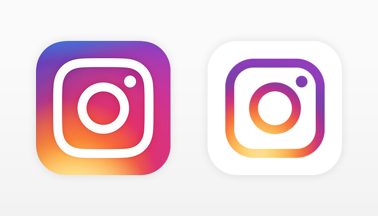
Launched in 2010, image-based social network Instagram was the first to have Facebook seriously worried. So they bought it, two years later, for an estimated $1billion. In the same year, Instagram debuted its faux-leather camera icon, which its massive worldwide community took to their hearts.
There was a big backlash this May, then, when that skeuomorphic design was jettisoned for a radical flat redesign (shown above). But despite all the wailing and gnashing of teeth, it’s unarguably a more flexible design for small screen sizes, as Ian Spalter, Instagram’s head of design, wrote in a blog post on Medium. And we rather like it. Time will tell, but we think that eventually, the world will too.