Label printing is an important part of product packaging and branding. Even though printing technology has improved, businesses struggle with label printing. These mistakes make your product appear unprofessional and can impact your branding.
So, in this article, we are going to discuss the top mistakes to avoid with full color labels. Let’s dive in.
Poor Printing Quality
Mismatched Colors
Overcrowded Information
Grammatical and Spelling Errors
Unreadable Font
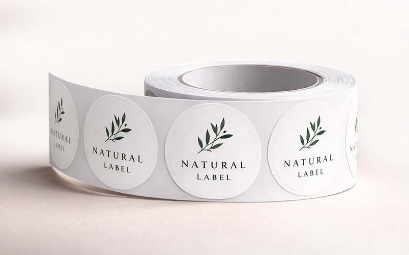
Incorrect Shape and Size
One of the most frequent problems in logo printed roll labels is poor printing quality. It includes smudged graphics and faded text. Poor label printing quality can lead to low-quality files. To avoid this, make sure you use high-quality images and designs, usually, 300 dpi. Also, make sure you are working with a reliable printing service that specializes in roll label printing.
Mismatched colors tend to hamper branding. This can make your product look inconsistent. The issue arises when the color profiles of the design are different than those of printing. Use CMYK color settings for the designs of roll labels. To check the color accuracy, ask for a physical proof from your printer.
Labels that have excessive texts can overwhelm your customers. For instance, a shampoo bottle with a large amount of information about the theory behind shiny hair at the back can frustrate your target audience. No one is going to read that essay while taking a shower. Hence, make sure that you go only with the essentials. Information overload confuses the target audience.
If your affordable roll label printing has grammar and spelling mistakes can make your product appear untrustworthy. It can also dilute your brand’s message. A loss of trust means a loss of sales. Thus, you should review your final custom label artwork. Use spell-checkers for your important text.
Almost every buyer checks the nutritional panel on the roll labels. If they are unable to read, it can impact their buying decision. Fonts play an important role in label readability. Choose clear and readable fonts that go with the brand tone. There must be enough contrast between the background and the text to improve visibility.
Designing roll labels without considering the shape and size of the packaging can lead to poor alignment. A label that looks good on a flat surface might not fit properly on the curved bottles or jars. Text distortion and wrinkling can occur when the label dimensions do not match the surface of the product. Always test your label on the actual product before mass printing.