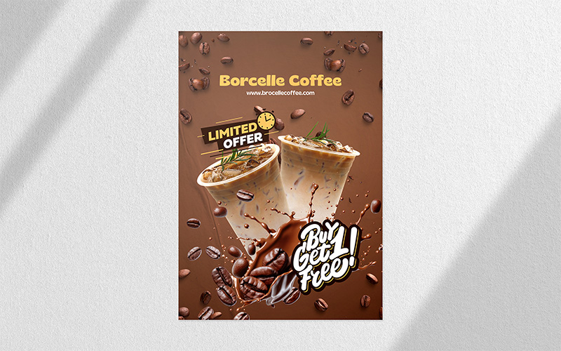
Poster printing is a traditional medium for promoting a business. Many marketers launch poster marketing campaigns to promote new products or services. Businesses looking to cut their cost in advertising and marketing can use posters to grab the attention of customers.
To design a poster that stands out, here are a few design tips you need to follow.
- Make It Readable from a Distance
- Make the Message Clear
- Use a Big Image
- Choose Minimalist Design
- Make Good Use of Space
Poster printing is visible from a fair distance due to its large size. However, the information they convey must be readable from a distance. Your viewers don’t care to come close to a poster to read it. Most of them are not going to read the poster in fine print.
The poster content structure should be put on view in three distinct layers. Place the headline at the top and make it bold. It will be readable from a distance due to the larger fonts. Choose unique but readable types that grab attention. The next level consists of the details. Give the main information. However, the font size for providing details should be half of the primary headline. If you want to use a larger scale, ensure it is separated from the headline. Place the minor details at the bottom of the large poster printing in smaller fonts.
As you are looking to promote and share information about your business through bulk poster printing, it is better to make it simple and straightforward. When you are designing posters, ensure you use a straightforward language. Don’t beat around the bush. Anyone who comes across your poster should not be confused after reading it. They should be able to read it easily and understand what you want to convey.
One of the best tricks to grab attention is to add a big image that can be seen from a distance. You can choose a big image or illustration. Consider using close-up design elements or faces, scenes, or illustrations. However, make sure that you choose the visual prudently. A big picture at the top or middle of the poster won’t just grab attention but also help generate sales. A big image will linger on in your viewer’s memory for a long time. This helps in building brand identity.
When it comes to poster design, less truly is more. A cluttered poster filled with too much text, too many colors, or competing images can overwhelm viewers and dilute your message. Minimalist design, on the other hand, draws attention with its simplicity. By using clean lines, enough white space, and a clear visual anchor. You make it easier for your audience to absorb your message immediately. Minimalist posters stand out in busy environments because they don’t compete for attention. Use no more than two fonts and stick to a limited color palette. This streamlined approach is modern and effective.
When it comes to the designs for a dry erase poster, space plays a crucial role. This is because people view it from a distance. It is better to use greater spacing between elements while designing a poster. An advantage of additional spacing is that it can improve visual impact. Also, it makes the poster readable.


