Your business envelope might be the first impression your brand makes when it reaches your target customers. A well-crafted envelope can improve open rates, reinforce brand identity, and increase credibility. But poor design for your envelopes can have an adverse effect.
To get the most out of your envelopes printing, you need to avoid the design mistakes given below.
- Neglecting Brand Consistency
- Selecting the Wrong Size
- Poor Font Choice
- Overloading the Design with Excessive Information
- Adding Low-Quality Logos and Images
- Not Adding a Call to Action
- Not Using Custom Printing Features
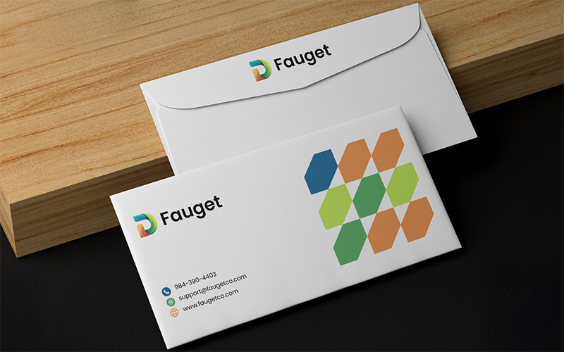
Your custom envelopes printing must align with your overall branding. Using different fonts, colors, or logos than the ones on your business cards or website can be confusing for your recipients. Consistency builds trust and ensures your business is easily recognizable. To ensure consistency, choose the official fonts and colors of your brand.
Business envelopes come in different sizes, and choosing the wrong size can result in damaged contents or higher postage costs. Sending documents in bulk in a small envelope or folding them incorrectly can make the mail appear unprofessional. So, make sure that you consider the size of your document before deciding on the envelope size.
Decorative and fancy fonts might appear stylish for your Tyvek envelopes, but they can also make the content on them difficult to read. In the same way, using fonts that are too small can make the branding elements and addresses hard to distinguish. Hence, you must stick to legible and professional fonts. Also, ensure that the size of the fonts is large enough for easy readability.
Your envelope must look professional and clean. Overcrowding with too many elements, such as multiple images, excessive text, or cluttered graphics, can make your remittance envelope look unappealing and messy. Thus, make sure that you keep it simple. Only add essential elements, such as your return address, logo, and tagline, if needed.
Pixelated and blurry images and graphics can make your envelopes appear unprofessional. Poor-quality prints on your promotional or invitation envelope printing can create a negative impression about your business. It is always better to use images with a resolution of at least 300 dpi. Moreover, the logos should be vector-based. This ensures they are clear and crisp.
An envelope is not a simple container for your business mail. It is a marketing tool. In case you fail to use it for prompt action, you are missing out on a chance to engage your recipients. Hence, make sure you are adding a subtle call to action in your envelope, like ‘Limited-Time Discount Enclosed’ or ‘Special Offer Inside’. This will encourage your recipients to open the envelope.
Basic envelopes easily blend in and might get ignored. Not using customized colors and other personalization features means you will lose out on an opportunity to make an impact. Explore your personalized printing options to give your envelopes a professional touch. With a unique design, you can make your envelope stand out in a pile of mail.
By avoiding these common mistakes, you can create envelopes that not only look great but also enhance your brand’s credibility and marketing effectiveness.