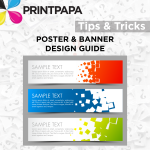
Posters & Banners are the most affordable means of advertising and most businesses don’t have a dollar to waste. What’s more, signs are always on the job for you, advertising 24 hours a day, 365 days a year.
When you are designing your sign; you should always utilize the resources of an experienced sign professional. However, if you wish to create your own design, its important to keep the following criteria in mind:
HOW LONG WILL IT LAST?
Choosing the proper Banner material is essential for lasting & durability. The right material will determine how long your sign will last; and what the look and feel of your sign is.
If you want your banner to look good for an extended period of time ( ~ 3 months or more – particularly outdoors where the banner may be subject to wear and tear); you need to make sure your banner is at least 15 mil thick. For sizes up to 5ft, order from this Banner Section. If you need a larger size (from 5ft to 16ft) you can order here.
HOW DOES IT LOOK?
Design your banner or poster with some kind of catch phrase and be very crisp and precise. Too much text and too many images will confuse the viewer. Make sure the message is to the point. Use proper fonts and sharp images.
Even if your poster or banner is visible, if it can’t be read by your intended audience, it has minimal impact and decreased value. Some of the things to keep in mind are the following:
- Letter Size. Letters that are too small to read are commonplace in many signs today. For a quick reference on what size letters are needed for your sign; examine this visibility chart taken from the research conducted by the University of Pennsylvania State and the United States Sign Council.
- Color & Finish Contrast. Letters that blend in with their background become illegible at moderate distances. The amount and type of lighting, both artificial and natural, is important as well to overall legibility.
- White/Negative Space. Simply enlarging letters does not make them more readable. Proper letter kerning (the space between letters) and leading (the space between lines of text) have almost as much to do with legibility as letter size. Maintaining a high degree of white or negative space is important to keep the letters from running together or running into other distractions around the sign.
- Logos. Do you have a logo that fits well with your banner or poster? Inclusion of graphical elements or a logo should complement the sign message and in most cases not overpower the entire artwork. Some logos (Such as McDonald’s, Coca-Cola, etc.) are strong enough brands that virtually no text is needed for their sign-however this is not typical for most business owners who need to send some message to their intended audience.
HOW FAR IS IT VISIBLE?
A banner or poster that cannot be seen should not be created. Identify the type of traffic your sign is meant to attract (sidewalk traffic, downtown vehicles, or highway traffic, for example) and use the proper size, color, angle, lighting, and placement for maximum visibility. Many of the decisions relating to visibility are limited by your local sign ordinances; so consult an expert for this information.


