Flyer distribution is an effective tool for businesses to spread the word about what they have to offer. A well-crafted flyer can grab the attention of your target customers and share information effectively.
However, this requires a thorough understanding of flyer printing design principles. Here is a complete guide on the do’s and don’ts of professional flyer designing.
Dos
- Use an Attractive Headline
- Keep It Simple
- Use Consistent Graphics
- Add a Clear CTA
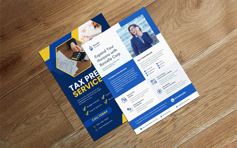
- Use Both Sides of the Paper
The first thing your target customers are going to read on the rectangle flyer is the headline. Ensure that the use of a catchy, informative statement that tells your customers what the flyer is all about at one quick glance. Often, businesses make the mistake of using a brand name rather than an attractive headline. Nevertheless, it is necessary to remember that it is a promotional tool to advertise what you are offering.
You should always use simple designs for your rectangle flyer. The recipient should get a clear idea of what you have to offer within a few seconds. Use precise and clear text, balanced white space, and visually pleasing color. Moreover, the design of the flyer must be uncluttered to make it simple but functional.
The images and colors you are using must reinforce the message and remain consistent with your brand. Use the same colors and graphics that you use for your brand logo and other marketing materials to maintain consistency.
Every folded flyer you are designing should encourage your reader to take action. Whether it is getting in touch by calling, visiting a website, or attending an event, add a compelling and clear call to action that will encourage your recipient to act swiftly.
Your target customers will only take your flyer when they are interested in what your business has to offer. Thus, ensure you use both sides of the flyer to print out your information. Even when someone is just casually checking the flyer, they might be intrigued enough to take a closer look.
Don’ts
- Include Excessive Information
- Use Low-Quality Graphics or Images
- Use Cheap Quality Paper
- Make the Text Difficult to Read
Using your flyer to say too much about your product or service can land you in trouble. Adding excessive images and text can confuse your readers and make the flyer appear cluttered. Make sure you are adding only relevant details. Leave enough white space for balancing the design and ensure it is visually appealing.
When you are printing die cut flyer, ensure that you are using high-quality graphics and images. Go for high-resolution graphics and photographs that complement your message and don’t distract your potential readers.
Using poor-quality paper will make the die cut flyer appear unprofessional and cheap. It reflects poorly on your brand. Thus, make sure that you are using good-quality paper for your flyer printing.
Text is one of the most crucial aspects of flyer printing. In case your target customers are unable to read your flyer, there is no point in distributing it. Selecting the wrong font size and colors is something that you should consider carefully. If you make the fonts simple to read, you can get optimum results.