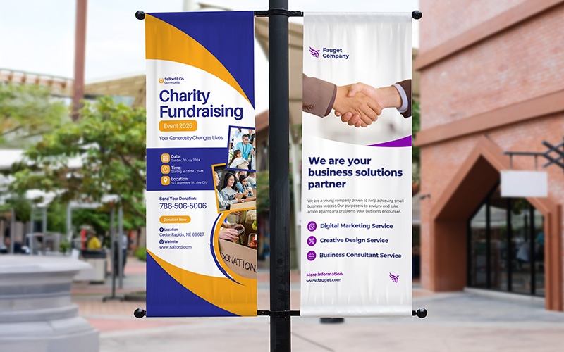
Customized banners are educational tools that can help in communicating your brand message effectively. Businesses with well-placed, attractive banners can experience more engagement from attendees.
However, even though banners are highly effective, they can easily fall flat if aren’t designed properly. Often, businesses end up making mistakes with their banner printing. So, in this blog, we are going to discuss the slips you must avoid with small or large banner printing.
- Not Selecting the Right Colors
- Typos and Misspellings
- Not Paying Attention to Contrast
- A Lot is Going On
You might spend several hours designing your banners, but it doesn’t matter if you don’t choose the right colors. With the right colors, you can direct the eyes of your customers to the banner. Often, businesses fail to realize that colors generate certain emotions. It is known as color psychology.
Thus, the mistake here is you select the wrong color for your vinyl banner printing. You might end up sending the wrong message to your audience. Also, you might convey an emotion that does not resonate with your customers or add value to your brand.
For instance, red and yellow exude the feeling of excitement. Hence, they can be used for restaurants and food joints. But it won’t go well for the dental office as this place has little to do with excitement. So, you must learn the meanings of the colors to find the most suitable one for your business banner.
This might have already happened to you before. Typos in banners are more common than you know. Imagine how horrific it can be if you take the time to create the perfect banner for your business and print it only to realize there is a big typo on it.
Even the tiniest spelling errors can hurt your brand. It can make you appear like you lack professionalism and attention to detail. Again, if your typos have other insinuations, it can further hurt your brand. So, make sure your banner text is reviewed by at least two different before. You can hire a professional editor to check out the banner before sending it out.
A reason why fabric banner printing can be arduous to read is that it lacks significant contrast. Try reading it against an orange background and use yellow lettering. This can be very difficult. Use color psychology for the best contrast. However, make sure that you use white and one dominant color. The contrast you achieve will enable the message to resonate with anyone setting eyes on it. Within just a few seconds of coming across the sign, they will understand what it says and follow the CTA to take the next action.
You might have come across a banner that has a lot going on. This can make it difficult for your target customers to figure out what the banner has to say. Businesses easily fall victim to this. You want to send a message, and you can easily overwhelm the mesh banner printing with too much information.
However, there is a way around this. Restrict the number of words on the banner and get your target customers to interact with the brand. If it is for an event, write down the specific details in bullet points to reduce clutter.
