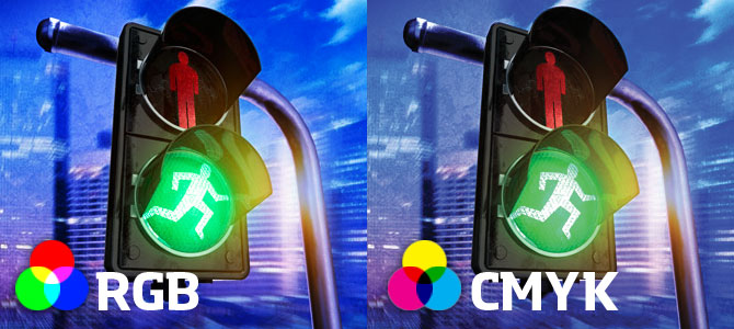
It’s the age old tale. Designer designs artwork. Designer sends artwork to print. Print shop sends the print job back to designer and the colors are all wrong. It happens way more often than it should and the worst part is, it can be avoided. The reason the colors on your print job are wrong can be one of a few, but the most common reason is the color mode.
Before we get into what needs to be done, lets first explore the two types of Color Modes or CM’s.
RGB or Red Green Blue. You are experiencing it right now. RGB is an additive type of CM that combines the primary colors in variation, to create other colors. It is the CM used for all digital display. Computer screens, Cell phones, Tablets and so on. RGB offers a very wide range of colors and is best suited for digital imaging.
CMYK or Cyan Magenta Blue Black. Every printer uses this four color process to generate full color images. CMYK is a subtractive process meaning each color added means more light is removed or absorbed to create other colors. The first three colors combined don’t create black, more like a dark brown, however when the K is added it removes all of the light from the picture and the eye perceives it as black.
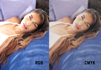
“Now, what does this mean to me when I design?” Great question. The best practice when creating a design for print is to do so in CMYK. There’s nothing worse than getting your business card back and the colors are nowhere near what you wanted. If you design it in the correct CM, the printer won’t have to convert the files, thus destroying your intended color scheme. For every RGB color, there is a comparable CMYK color. They don’t always match perfectly, but the differences are rarely easy to detect by the average person. Keep in mind, the hardest color to match is going to be Blue.
Another note to keep in mind is the fact that CMYK will always look more muted than RGB, especially when you look at them on screen. A good way to make sure you get similar colors or as vivid an output as possible, is to place a photograph side by side (one RGB and one CMYK) and play with the color values and contrasts on the CMYK version until it looks close to the RGB. Most times, this is not necessary, but if you are really particular about a picture it’s a trick you can use.
That’s a pretty brief overview of the two different CM’s. Remember, RGB is for screens and CMYK is for print. If your colors don’t look right on a print job, there is a good chance you sent the printer an RGB file. Happy printing!


