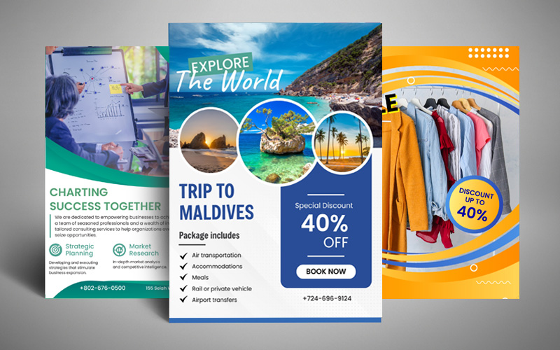
Flyers are a cost-effective and efficient marketing strategy suitable for all age groups. Printing them can help in promoting your products and services for a wide range of audience.
Professional flyer printing can blend easily with your business requirements. Nevertheless, not everyone knows how to create the best-looking flyers and often end up making mistakes. To make you don’t, continue reading this article.
Here are the top mistakes you should avoid when printing a rectangle flyer for promoting your brand.
- Choosing Poor Quality Images
- Not Including Important Information
- Including Unnecessary Details
- Adding a Boring Headline
When including images on your flyer, it’s crucial to ensure they are of good quality. In simpler terms, make sure they are clear and easily understandable. If people can’t discern the content of the photo, it won’t contribute much to the effectiveness of your flyer. Images can be a powerful asset in your marketing campaign. However, it’s essential to use them wisely and ensure they enhance the overall message and appeal of your flyer.
You have chosen folded flyer campaign to spread information about the brand or the products and services you offer. So, not including important information will only be a mistake.
To ensure your flyer provides all the necessary information, make sure to include the "who, what, when, where, and why" of the event or happening. These key details will give people a clear understanding of the essential information. Once you have covered these points, you can then consider adding any additional details as needed. By following this approach, you can create a concise and informative flyer that effectively communicates the important aspects of your event or happening.
While it may be tempting to include every piece of information about your event or store on your flyer, it’s important to avoid overcrowding. When a flyer becomes cluttered, it becomes challenging for people to navigate and focus on the key details. If there is an excessive amount of information, it becomes difficult for people to remember the most important points. Thus, you should focus on the the essential information and keep the design clean and uncluttered. By providing a clear and concise message, your flyer will be more effective in capturing people’s attention and conveying the necessary information.
If your flyer headline is not attractive enough, you can lose out on many customers. Capture people’s attention from the start by crafting an intriguing headline for your flyer. Your headline should be informative and engaging, enticing readers to explore further. While it doesn’t have to rely on amazing puns or excessive humor, it’s beneficial to infuse a touch of creativity into it.


