Recently we’ve had several designers question why our rejection of certain files submitted for various print jobs.
The simple answer is: We have very high standards for what we accept and offer our customers.
It is important for all contributing designers, free-lancers or ‘aficionado’ to remember that just because they design a piece of print, it doesn’t mean that its ready to get printed. Our pre press gurus evaluate each file for quality, color compensation and correct press-specifications before they determine that it can be printed. Once the pre press work is done and accepted files are released to our Presstek sheet fed machinery.
The following are simple tips to insure a more successful design technique that will ensure the least amount of problems throughout our press guidelines:
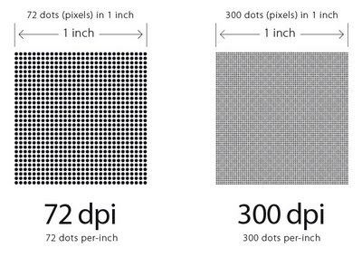
1-PRINT=300 WEB=72.
I’ve seen it a million times. A lot of submitters don’t fully realize that everything that is being posted on the web fails most of print’s resolutions specs.
Its really simple. All graphics meant for web use are created at 72dpi (dots per inch). Printing requires a standard 300dpi resolution to achieve better looking images.
The result of having 72dpi images printed on the offset is often a bad idea and result in pixelation of the images.
To prevent this, make sure that you work with images whose resolution does not go lower than 300 dots per inch when used at 100% size.
2-THE ETERNAL RGB VS. CMYK BATTLE
“So..I submitted a 300 dpi file.. on RGB mode. Colors look amazing on my screen but on my printed piece, colors look dull”..
This is probably the most common error that we see at printpapa.
RGB color mode is used to represent colors through the light spectrum using Red, Green, Blue bulbs. Most scanners will use this mode by default since they pick up the image on the scanner bed using a beam of light and reading back the colors as RGB values. Also, all images meant for web are by default created as RGB mode.
Having these two factors in mind, it’s easy to understand how a lot of media available to any designer is more than half the time created in RGB mode; unfortunately print procedures do not use light to reproduce colors, but rather a combination of inks (Cyan, Magenta, Yellow, Black – CMYK) that when combined it creates the illusion of millions of colors on a page.
To make matters really interesting, RGB spectrum is a wider gamma than the spectrum used for printing. Thus when some color might exist in the RGB spectrum, does not necessarily means that it also exists on the CMYK spectrum resulting in colors looking dull.
To prevent unwanted color shifts when printed pieces are submitted to us, make sure to design using pieces that have been converted to the CMYK spectrum before finalizing your art.

………
More simple tips to ensure a proper file submission to follow..
Watch for the a continuing blog in this series.
Or send us your questions/suggestions and comments at contact@printpapa.com

Excellent article, precise and to the point. Not sure ifanybody could have said this any better. Looking forward to the next in this series. Way to go David…
Great idea, but will this work over the long run?