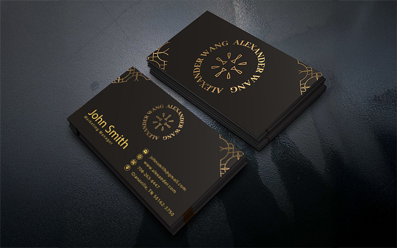
Archive for the Design Tips Category

Logo Design. The good, the bad and WTH?

The first impression  ”John Q. Consumer” will have of your company, more often that not, will come from your logo. Still, it’s always appalling to see some of the horrid imagery people use to represent their company. There are truly a ton of guidelines that various designers and “experts” have come up with over time in regards to the right and wrong way to design your logo but, here are a few that should give you a decent start.

1. MAKE SURE IT LOOKS GOOD. Yes that seems like an obvious rule but, you’d be surprised how many people disregard it. Share you logo idea with trusted friends and if you aren’t an artist, have someone professionally create the logo for you. That being said, if you cant afford logo design there are a few free services that will help you along. a few of those are FreeLogoServices.com, LogoEase.com & LogoMaker.com. There are some fees involved on most “free logo” sites but, they are lower than hiring someone.

2. KEEP IT CLEAN. Not clean as in pg-13, the image you want to represent your company is up to you. We mean clean as it pertains to legibility and cleanliness of design. If people can’t read your company name, it defeats the purpose of a logo. Don’t be afraid to have an “abstract” design but, there has to be a method to your madness. Your logo should transfer well from medium to medium, from paper, to shirts, to web and so forth.

3. BE INSPIRED. Most designers prefer for you as the client to have some idea of the direction you want the logo design to go. The only problem is, you often don’t know what looks good. There are sources of inspiration everyday throughout the day (provided you don’t reside under a boulder). Look at other companies and see how simple of complex their ideas are. Another idea is to visit graphic design websites. There are sites that showcase logo design and it wont cost a penny to peek. LogoPond.com and LogoMoose.com are two good ones.

These are in no way rules or regulations, just a few tid-bits of info to get you started. The most important thing to keep in mind is that you will have to live with that logo for the remainder of your companies life. A nice logo makes branding easy and branding equals success.

Date: 2nd December, 2011 | Under: Design Tips | No Comments

Trade Show Fashion Faux Pas

It doesn’t take a fashion expert to know that some things don’t belong at trade shows. Here are a few examples of what not to wear at trade shows and other business events:
faux pas

  • Too much or too little. There is nothing worse than freezing or sweating at a networking event. Dress in comfortable layers that you can easily add or remove as needed, such as a suit jacket over a dress shirt.
  • Clothing without a pocket or two. Pockets are always handy for business cards, pens, breath mints, etc.
  • New shoes. While new shoes may look nice, nothing looks worse than missing out on important introductions because you can’t stand to be on your feet. Trade shows usually involve long hours and lots of standing and walking. Stay in the game by picking a shoe that’s made for walking, or watch the competition walk all over you.
  • Cologne. Fragrances should be alluring, not overpowering. If you are within talking distance and can smell someone’s perfume or cologne, it is too strong.
  • Clothes which are too tight, too short, too revealing. No matter whether your pants are popping a button because they shrunk in your closet or are snug by choice, clothing that is too tight is not only unprofessional but distracting.
  • Gaudy jewelry. You want to be remembered for your personality or impressive product knowledge, not your giant jangling earrings or over-jeweled hands.
Date: 28th November, 2011 | Under: Design Tips, Marketing, Tips & Tricks | No Comments

The Power of Words

Here’s a little story about how the power of words can evoke emotion, especially in the world of marketing.
An elderly blind man was sitting on a busy street corner with a cardboard sign next to an empty tin cup. The sign read, “Blind — Please help.” People would glance at the sign, but nobody gave the man any money.

Then a young copywriter saw the man with his sign and empty cup. He felt disappointed as he watched all the people walk past without an ounce of empathy, so he took a marker, flipped the sign over, and rewrote the blind man’s message.

Suddenly, people started putting money in his cup until it was overflowing. Surprised, the blind man asked a stranger to tell him what the sign said. He replied, “It’s a beautiful day. You can see it. I cannot.”

Date: 4th November, 2011 | Under: Design Tips | No Comments

Why You Need to Update Your Logo Every 5 Years?

Large organizations changing their logo designs have become a common occurrence. Most of the companies change their logos after every five years or so. Last year two popular companies decided to change their logos. Logo change of Gap and Starbucks made headlines. While the new logo of Starbucks was well received by their fans, Gap attracted quite a lot of criticism. Thus modifying a corporate logo requires a lot of deliberation. The corporate logo is not only displayed in the product packages they are also essential to elucidate what the company is all about without speaking a single word. Though some companies seem to be in frenzy about changing their corporate logos (at times even thrice in as many years) but too much change can distract the loyal customer base. Changing the logo once every five years is an inevitable fact for businesses.

But what are the reasons for logo change and how it can help the businesses? Let us find out:

  • Growth: With every passing year businesses will invariably grow and have higher profits. There are many ways in which a company grows. Some companies opt to merge with other big names in the industry to create a stronger brand entity. While some other companies grow by acquiring other smaller companies to add more value to its current business. Some companies might grow independently without taking recourse to the above mentioned steps. Whatever be the situation, the company has to change their logo to signify the change or growth.
  • New Values and Practices: Sometimes the logo change might not be due to the financial prosperity. Logo design change may also be triggered by change of vision and mission. Logo change often brings out the true business objectives and helps in brand positioning. While some companies go for an entirely new logo to signify their change other companies try to make some required changes.
  • New Services, Products or Technologies: Companies always look to expand their list of services or products. You can make the customers aware of the latest changes in the company with logo change. Though updating the logo each time you introduce a product or service is not a wise idea, but if some of the products or services have been popular among the users then the same can be used in the logo design.
  • Bad Press: Many times companies make enormous mistakes that cause their disrepute. You have to take quick steps in such instances before the situation gets out of hand. May be you are harming the environment in some way, you can reboot your brand image by adding a green colored logo which will say that the company will take environment friendly measures in the future.


So changing corporate logo is important in many ways for the corporate houses. A company goes through many changes in five years and thus it is a fitting time to think about the logo change. Reputed printing service providers such as PrintPapa can help you create a catchy logo and then use the new logo in all your promotional materials. You can promote your company effectively with the new logo and various promotional materials available at PrintPapa such as Brochures, Envelopes, Business cards, Banners, Bookmarks, etc.

Date: 1st September, 2011 | Under: Design Tips | No Comments

Should I print it 2-color or 4-color?

If you still lived in the early days of printing then this question would have never crossed your mind because two color offset printing was the only option available in those times. With the growth of digital printing technology there are new options available now for commercial printing. Four color digital printing is a viable option for all the marketers in today’s times. But the availability of the two color and four color printing process has left many people confused. This is the reason, understanding the advantages and disadvantages of both these color printing processes is important.

Two color offset printing is one of the most common processes for high volume commercial printing. In this process the image to be inserted is placed on a plate and then transferred from the plate to a rubber blanket, which again is moved to the printing surface. Two color printing is mainly based on the use of oil and water. Ink rollers supply the required ink to the images while the non printed area attracts a film of water. The film of water keeps the non printing area free of any ink. In four color digital printing process the mechanical steps such as manually stripping the pieces to create a plate and making films for color proofs are not needed.

Now, let us take a look into the advantages of both these processes to make a comparative study:

Four Color Digital Printing Advantages

  • It provides a shorter turnaround as it does not require much manual work.
  • All the prints have same color. There are lesser wastes, accurate counts and the color remains constant as there is no need to balance the ink and water during digital printing.
  • It costs lower for high volume of printing. Though the per unit cost of each piece is higher than in offset printing, but when you consider the set up costs, you will find that four color printing costs much less nowadays as the there is no setup cost in digital printing.
  • There are customization options in four color printing without slowing down the print speed. The information stored in the databases can be used to provide unique copies every time, such as ones for the personalized letters used for marketing. This process is called Variable Data Printing.

Two Color Offset Printing Advantages

  • It will work on many types of surfaces other than paper such as cloth, metal, wood, plastic, leather, etc.
  • If you order for a large quantity of prints then per unit cost goes down.
  • Modern two color or 4 color offset presses use computer to plate technology which assures higher quality.


Are you still not able to make up your mind? Then use the below given checklist.

  • Quantity: If you are ordering for a large number of prints then the cost per unit would be considerably less for two color offset printing, while if you are looking for short run printing then four color digital printing is your definite choice.
  • Printing Medium: If you need unusual printing surface, special type of paper, unique size, etc. then offset printing is a good choice. Though the options are gradually increasing with four color printing too.
  • Color: If you require only black and white prints then the two color process is a choice you can make. While if you want many colors to be used in your prints then the four color or digital printing is your cup of tea.
  • Turnaround: Four color printing is totally automated and controlled by the computers so it will give you faster turnaround. So if you have a time constraint, four color printing should be your choice.
  • Proof Checking: Four color digital prints offer better proofs as they produce a sample of how the actual printed piece would look like.

So make the choices based on your requirements. You may also ask for suggestions from the experienced printing service providers such as PrintPapa. They have expertise in offering high quality printing for various promotional materials such as rack cards, greeting cards, posters, short run books, NCR forms, etc.

Date: 26th August, 2011 | Under: Design Tips | No Comments

What are the Brochure Design Elements?

Originally brochure was a marketing material solely associated with the educational institutes, but nowadays it is used by all sizes of business – whether small, medium or big. Brochure is often the first impression that a potential customer makes about a company. If they are well crafted and designed then they will create a positive impression in the minds of the potential customers. With the proper utilization of a brochure you can convert many potential customers into your customers. But in order to get success with the promotional brochure the designing is very important. Whether you want to perform the designing tasks yourself or hire a graphic designer with a lot of expertize, you should know the basic brochure design elements. By having such a knowledge you will ensure that your brochure designing budget does not go a waste. You can also hire the services of the best designer if you are able to ask him/her pertinent questions learned about the brochure design elements. If the designer is not able to answer some of the pertinent questions then it is time to move on. Below are some of the important elements of brochure design.

  • Uniqueness: Any brochure should tell the readers something unique which differentiates your company from the rest of the crowd. Uniqueness starts right from the way your brochure is designed. Ask the designer from where he/she gets the design inspiration. If the designer says from businesses in the same sector as yours then it could be a red flag. You will not like to get a copy of your competitors brochure design.
  • Simplicity: Cluttering the brochure with heaps of graphics and texts because you have space does not make sense. A brochure should contain only the most relevant information such as the testimonials and benefits. The information, however, will vary according to the function and the audience of the brochure. Ask the designer which design elements can lead to a good brochure design. Remember, lots of images and big texts in various colors can make the brochure hard to read. So if the designer recommends these usages then it is better to move.
  • Resolution of Images: Question the designer on what types of images he/she is planning to use. If the designer is planning to use stock photos make sure that these have high resolution. If low resolution images are used in the brochures they will look blurred and unprofessional. Even if the rest of the brochure looks great, the blurred images will diminish its appeal significantly.
  • Choice of Colors: Use of colors can evoke the right mood that you want the customers to have when they see the brochure. The brochure color should compliment the logo and the colors used in the company name. Ask the designer on the color he/she intends to use. If the designer intends to use the color that corresponds with the logo or the photos used then you are hiring the right professional for the job.


You should also make a careful choice of printing service provider. Only the most experienced printing agencies such as PrintPapa will be able to provide the highest quality of brochure printing. PrintPapa has wide experience in printing different types of promotional materials such as booklets, posters, banners, postcards, letterhead, flyers, NCR Forms, etc.

Date: 29th June, 2011 | Under: Design Tips | No Comments

How to Create Professional Booklets at Cheap Prices?

Booklet printing has become an integral part of the promotional campaigns of many companies – both small and big. They can offer a lot of benefits to the marketers and thus they are using these promotional materials extensively. But booklet printing can turn out to be a costly affair if the marketers are unaware of a few money and time saving techniques. Though you should never sacrifice professionalism of the booklet for the sake of low prices. Experienced marketers know many secret tips that assures that the booklet printing does not take up the entire marketing budget of a company. In order to make your booklet affective and attractive some tried and trusted methods should be adhered to. Below are some of the ways to achieve this purpose and save some money all at the same time.


  • Research from your printer: Hold prior discussions with the printing service provider and know about the standard sizes and weights of paper which are extensively used by them. Standard size and weight usually costs less. If you have taken up the services of an online printing agency then you can save money by printing only 32 pages for the standard booklet format (8-3/8”X10-7/8”) or 64 pages if you want the Digest format (5-3/8”X8-3/8”). If you require even lesser number of pages then print them in increments of 16. This will be the second most cost efficient tip.
  • Design the Booklet for the number of pages chosen: The layout with graphics and text should fit your budget and the marketing needs. Whether you need a 16 page booklet in standard or Digest format your design should be able to work within these number of pages.
  • Create an Attractive Cover: The cover for the booklet should be full color with glossy finish. Using the black and white or two color booklets makes it look cheap so opt for the colored variety. You may also use a high resolution photograph that will not cost more than some of the other full color graphics.
  • Create a thoughtful layout: You can achieve professional look with your booklet without hiring the services of a professional designer by following some simple steps. While designing the booklet do not use more than three or less font styles. Too many types of fonts look sloppy and distract the readers from the message. The design elements used in the booklet should be kept consistent while the layout may be tweaked slightly to avoid monotony. Most eye catching elements used in a booklet should be placed in the right hand corner as this is the location where the eye rests. High quality images and a standard glossy finish should be used in the booklet printing.

With the use of these design techniques you can attain a professional booklet design without costing anything extra. If you still feel you need to hire the services of designer, hire students who have proficiency in designing booklets. They will not only mete out professional designs but cost much less then the professional designers.

Another way to reduce the printing costs is to opt for a professional printing service provider having wide experience in dealing with various types of promotional materials. They will be able to provide cost effective alternatives for the booklet printing project. PrintPapa is one such professional printing agency having wide experience in printing various types of promotional materials such as rack cards, notepads, NCR Forms, brochures, calendars, etc.

Date: 27th June, 2011 | Under: Design Tips | No Comments

Tips To Design A Book Cover In MS Works

There is a burning debate doing rounds in the publishing industry that readership for books is decreasing significantly with the advent of Internet, but recent surveys have showed that book readership is stable and there is no decrease in the printed books followers. Thus many new authors are getting their deserved recognition everyday. In the past authors were just limited to writing the book and sending it to the printers. It was the job of the printers to organize all the text and pictures and decide on the desired layout of the book. But with the huge number of printing software and suites available in the market, nowadays there are many things else that a self publishing author can do. MS works is one such utility suite of Microsoft. It is a “word processor, spreadsheet and database suite”. Though you can not have the endless options available with the other larger office suites, but it has many basic tools which are helpful for the self publishers. This is a handy suite for home or office and  can be bought within a limited budget. If you know how to use MS Works then you will be able to create professional looking covers for any book, scrapbook, journal, etc. Below are some of the tips to design the book cover using MS Works:

  • Click on the icon to open MS Works. It will open the “Task Launcher” and offer you a number of options. Select “Templates” and open the template manager and then go ahead and click on the “Home and Money” category.
  • Choose “Journals” section from “Home and Money” and MS Work will provide you with five templates to choose from. Choose the personal journal option and use the template as the base template for the book cover design.
  • Next, select the option for personal journal template and click on “Use this Style” link which is displayed above the preview of personal journal. “Task Launcher” will now open the selected template in Microsoft Works.
  • After the template opens you should delete the second page present in the document. Select the text in the document saying “Personal Journal of Name” and insert the title of the book there. Choose the basic font styles such as Times New Roman or Courier from the drop down menu and select the font size 36 if you intend to send it to the printer straightaway. You can choose the font color for the book too from the menu.
  • Press “Enter” twice to drop down a couple of lines. Change the font size to 12 and press “Enter” again, then type your name. This is the best format for any professional book cover. Now go to the “File” menu and save the file with the option “Save As”. With MS Works you can also save the project as a Template and the option will appear in the Template Manager whenever you need it.


Now you are done designing the cover of the book. It is time to get in touch with a professional printing service provider with years of experience in printing different types of projects such as PrintPapa. This printing agency not only publishes books but can help you in the printing of different types of promotional materials such as Postcards, Rack Cards, Letterhead, Business cards, Envelopes, etc.

Date: 27th May, 2011 | Under: Design Tips | No Comments

The Importance of Resolution in Print

There are many books, posters, banners and other promotional materials published each day, but the people are still largely ignorant about the intricacies of printing. In the past years there was not much that you could do to help the professional printers. You had to select or sent pictures to the publisher and they work upon it to provide high quality pictures in your publications. But in today’s computer era there are different digital formats for pictures and it is important for you to know the terms and usage of resolution in printing.

Any original picture is referred to by the printers as continuous tone image. There are various types of tones from black to Grey through the various color spectrum. Every photo has a grain structure which is not seen by the naked eye (it is microscopic), but there is much more in a digital picture. The grain structure in a digital picture is called pixels. Each pixel in a digital image can have different values (as there are millions of color images) but the entire pixel value in the image has to be the same. When a picture is taken with the digital camera, you set a particular resolution for the camera. The resolution of the camera determines the pixel value for the image. The pixels are usually decided by the pixel height and pixel width. Such images are also known as raster images by the way they are screened – from top to bottom or left to right. Thus the pixel values in an image file are also determined in the similar order.

To create an illusion of continuous tone printing service providers use ink dots while printing. These ink dots are not same as pixels. These ink dots are usually printed on a rectangular grid which is called the Screen and is measured in ink dots per inch calculations. These ink dots vary in sizes. When an image gets darker the ink dots are larger but the dots per inch remain the same. Most people would now think that more the number of ink dots per inch better picture they will get, but the results depend on the quality of paper, printing service provider and the make of ink. 300 pixels per inch is required to produce a high quality picture at 130 line screen (with 130 ink dots per inch).

The advancement in picture printing has meant there is a lot of things to learn about printing. But whatever be the resolution of picture you will require them to be printed with high quality ink and paper. Thus it is important to take up the services of a renowned printing agency such as PrintPapa who have years of experience in dealing with photo products and other promotional material printing.

Date: 23rd May, 2011 | Under: Design Tips | No Comments

Tips To Create a Poster Using Adobe InDesign

As far as desktop publishing software program goes, Adobe InDesign is one of the most popular. Though there are many similar programs such as Quark Express, but InDesign is used widely as it can be integrated with the other software programs of Adobe such as Illustrator, Photoshop and Dreamweaver with ease. Designers using the InDesign can complete small projects (such as brochure and flyer’s designs) and large projects (like poster and book designing) in quick time and with relative ease.


Poster designing is one of the specialized area of work and in the present times designers are using the Adobe InDesign to make a short work of designing high quality posters for printing. If you want to learn the best uses of Adobe InDesign for poster printing then take a look at the below mentioned tips:

  • Click on the Adobe InDesign icon placed on your desktop.
  • When the software opens create a new document in InDesign by pressing “Ctrl” + “N”. Or open a new file by taking your cursor to “File” option on the top menu and then selecting “New” from a drop-down list that will appear.
  • Enter the key information related to the desired dimensions of the promotional poster when the “New Document” opens. After the page opens enter the height and width of the poster as per your needs. Enter the information in the “Height” and “Width” boxes. Also mention the proximity of the posters by deciding how close the borders will be to the edge of the poster. If you want no borders around the poster then enter the value “0” in the fields appearing at the bottom of the screen and the others will be reset automatically. In such cases you will get a full bleed poster off the page.
  • Select the color you want to add as a background for the poster. If you want to keep it white then skip this step. To opt for desired color, click on a rectangular selection tool that will appear on the left of your screen. Click and place the tool over the part of the poster where you want to insert the background color. Click on the Colors palette and select the exact color you need. You may also adjust the opacity by sliding across the bars in the left panel. This will make the background lighter as well as semi transparent.
  • To insert an image into the poster select “Ctrl” + “D”. When the image appears select the white arrow in the toolbox. Drag the image to reduce its size by clicking on one of its corners.
  • Use the “Text” tool in the tool box to insert any text (the tool looks like the alphabet “T”). Place the cursor to the area of the page where you want to insert some text. Then type in the words you want.
  • Next, click on the black arrow at the top of the tool box and move the positions of the different elements on the page. By using this process you can make each and every aspect of the poster meet your exact designing needs. After you have made sure all the elements are in accordance select “Ctrl” + “S”  and save the document. Now your promotional poster is ready to be sent to the printer!


Poster being one of the best promotional products has high demand among the business owners. Posters are popular among the youngsters as well as the aged. They are used widely, thus marketing through the posters is sure to make your marketing campaign a success. It is essential in this respect that the best choice of printing service provider is made. You might have all the skills with the Adobe InDesign software but it is only with the help of a professional printing agency such as PrintPapa can you achieve the desired printing results.

Date: 23rd May, 2011 | Under: Design Tips | No Comments


McAfee Secure sites help keep you safe from identity theft, credit card fraud, spyware, spam, viruses and online scams PrintPapa is PayPal Verified AmexDiscoverE check
Master CardVisaPay Pal
Our Reviews at
Click to see Yahoo Reviews (Opens in a new window)
100% Satisfaction Guranteed Adobe